The Importance of Responsive Design in Today’s Mobile World
In an era dominated by smartphones and tablets, the significance of responsive web design cannot be overstated. Responsive design ensures that a website can adapt seamlessly to various screen sizes and orientations, providing an optimal browsing experience for every user, regardless of device. This article delves into why responsive design is crucial in today’s mobile world, exploring its impact on user experience, search engine optimization (SEO), and business metrics.
Understanding Responsive Web Design
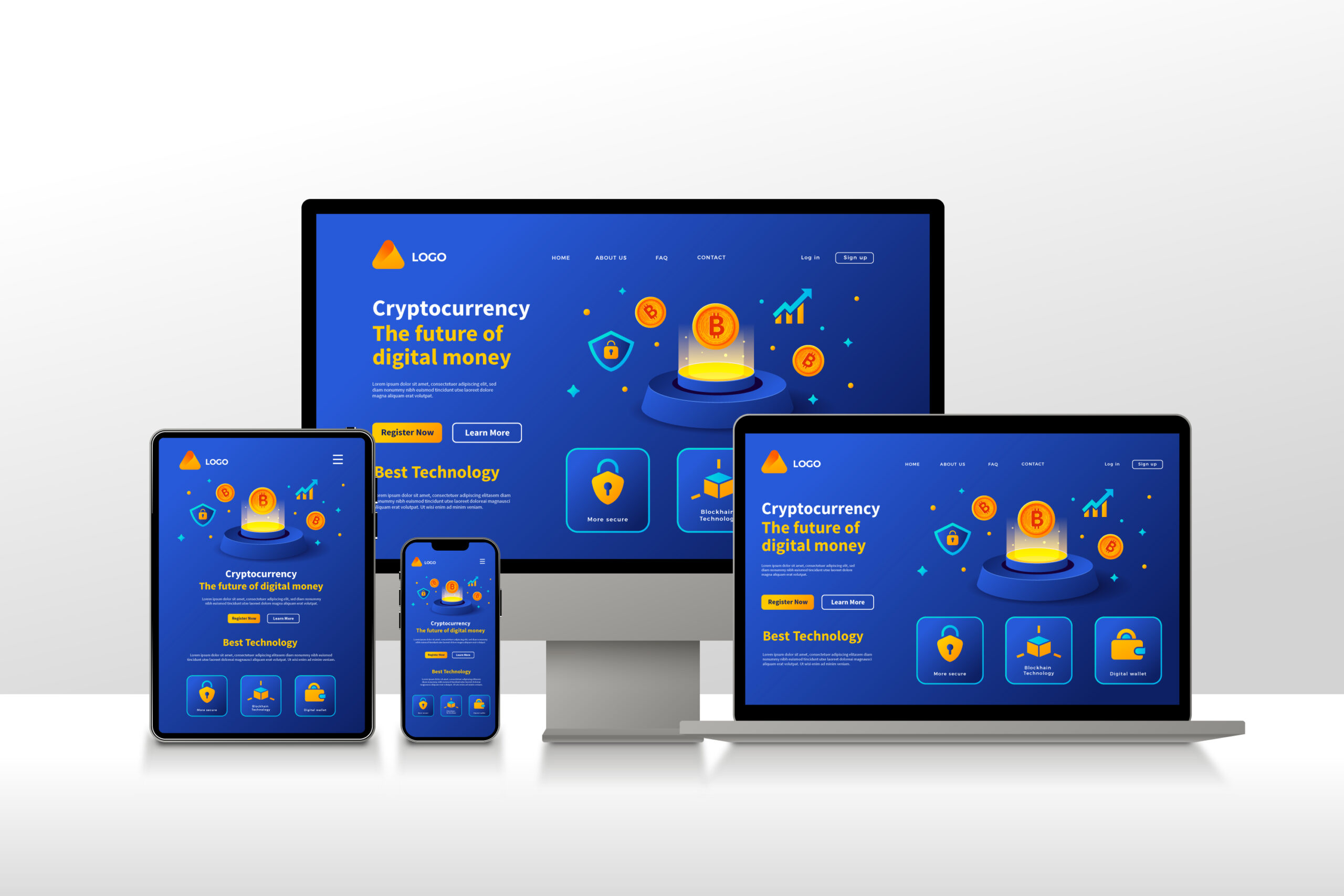
Responsive web: design refers to a web development approach that creates dynamic changes to the appearance of a website, depending on the screen size and orientation of the device being used to view it. This practice consists of a mix of flexible grids and layouts, images, and an intelligent use of CSS media queries.
As the user switches from their laptop to iPad, the website should automatically switch to accommodate for resolution, image size, and scripting abilities. This eliminates the need for a different design and development phase for each new gadget on the market.
Enhancing User Experience
User-Centric Approach: At its core, responsive design is about providing a smooth and engaging user experience. The content must be legible without requiring users to zoom in, and navigation should be accessible for both desktop and mobile users. A well-implemented responsive design anticipates and responds to the user’s needs and device capabilities.
Minimizing Loading Times: Websites optimized for responsive design tend to load faster on all devices, particularly on smartphones and tablets. Improved loading times contribute to a better user experience and lower bounce rates.
SEO Benefits
Google’s Mobile-First Indexing: Since Google switched to mobile-first indexing, the mobile version of your website becomes the starting point for what Google includes in their index. If a site isn’t optimized for mobile, it could hurt its overall search rankings. Responsive design ensures that your site is mobile-friendly and can improve your search engine rankings.
Reduced Bounce Rate: Websites that are easy to navigate and accessible are less likely to experience high bounce rates. Google interprets a lower bounce rate as a sign of a relevant and efficient website, which can boost your SEO ranking.
Cost Effectiveness
Implementing responsive design is highly cost-effective compared to maintaining separate sites for mobile and desktop audiences. With a single website, you can cut down on development time and costs. Additionally, managing one site allows for more streamlined analytics and optimization strategies.
Increased Conversion Rates
Responsive websites can lead to higher conversion rates. The consistent and user-friendly experience across all devices encourages users to take desired actions, whether that’s making a purchase, signing up for a newsletter, or filling out a contact form.
Maintaining a Competitive Edge
Adaptability: In today’s fast-paced digital world, adaptability is key. Companies that embrace responsive design can quickly adjust to new trends in devices and screen sizes without significant overhauls.
Brand Perception: A responsive website reflects a company’s commitment to providing a contemporary, user-friendly experience. This can enhance the perception of your brand among consumers, influencing their decision to engage with your business.
Future-Proofing Your Website
With the continuous introduction of new devices and screen sizes, responsive design is the most effective way to ensure your site will be functional and attractive on any future device. It represents a forward-thinking approach, emphasizing the need for websites to evolve in step with technological advancements.
Conclusion
The adoption of responsive web design is more than just a trend; it is a fundamental shift in how we build websites that are accessible to all users across all devices. As mobile traffic continues to grow, the importance of responsive design only intensifies. It not only enhances user experience but also contributes to SEO success and overall business growth.
Businesses that invest in responsive web design are positioned to achieve greater scalability, efficiency, and engagement, leading to a sustainable competitive advantage in the digital age.
FAQS
- What is responsive web design? Responsive web design is an approach where a website’s design dynamically adjusts according to the screen size and orientation of the device being used. It uses flexible layouts, images, and cascading style sheet (CSS) media queries to ensure the website works efficiently on all devices, from desktops to smartphones.
- Why is responsive design important for user experience? Responsive design improves user experience by ensuring that a website is easy to navigate and interact with on any device. This approach eliminates common issues like difficult navigation, slow loading times, and distorted visuals, which can frustrate users and lead them to leave a site.
- How does responsive design affect SEO? Responsive design is crucial for SEO because it helps in improving site usability, decreasing load times, and reducing bounce rates. Since Google uses mobile-first indexing, having a mobile-optimized website can also improve your site’s search engine ranking.
- Can responsive design help in reducing website maintenance costs? Yes, responsive design can significantly reduce website maintenance costs by eliminating the need to develop and maintain separate versions of a website for different devices. This unified approach allows for streamlined updates and management, reducing both time and resources spent on website maintenance.
- What are the business benefits of adopting responsive web demand? Adopting responsive web design can lead to increased conversion rates, improved brand perception, and staying competitive in a mobile-first world. It makes websites accessible and appealing to a larger audience, enhancing customer satisfaction and leading to potential business growth.